
Sherwin Williams Upward SW 6239: A Complete Color Guide

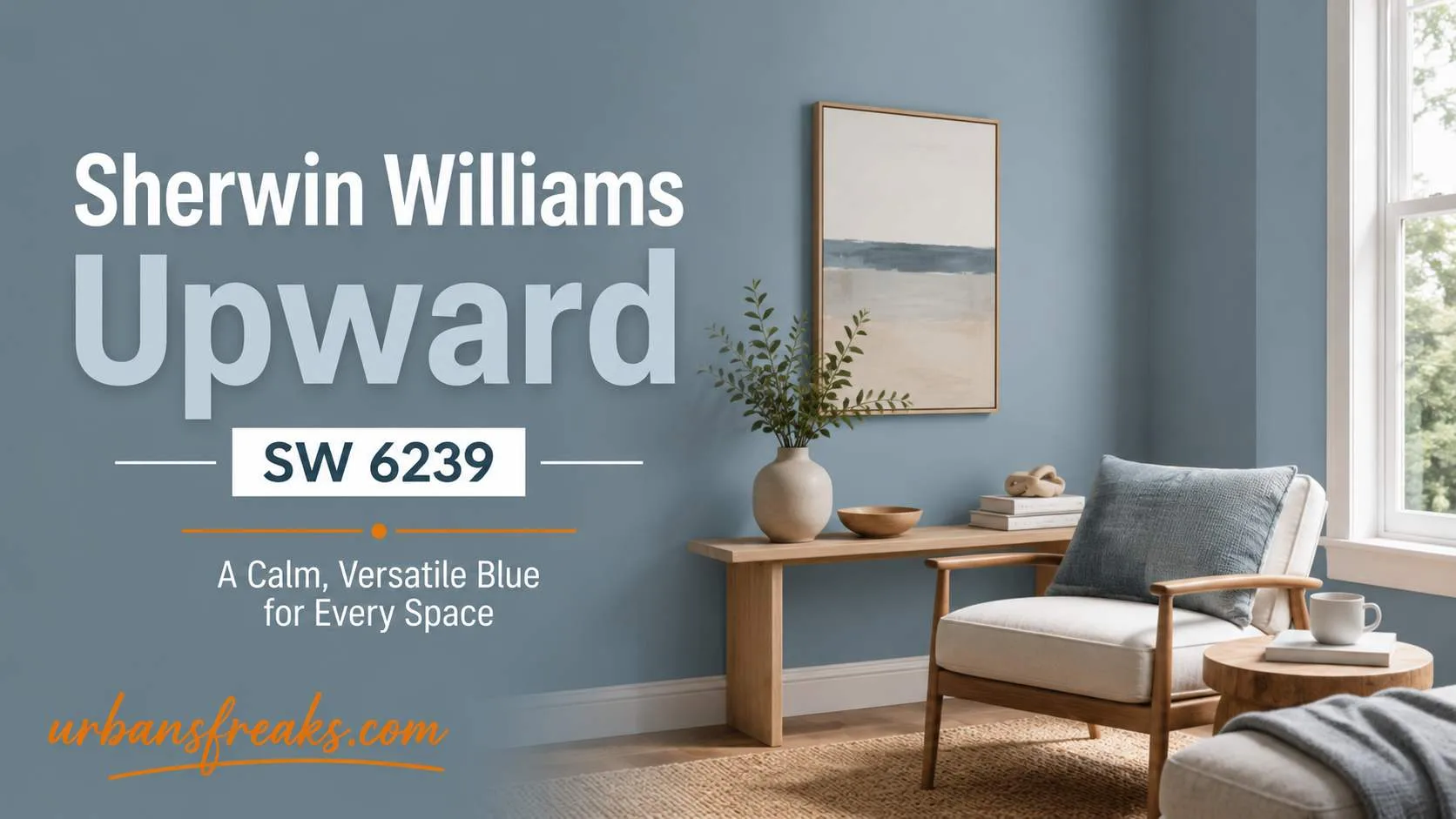
I get asked about this color more than almost any other. Sherwin Williams Upward SW 6239 was named the brand’s 2024 Color of the Year, and since then it has shown up in bedrooms, bathrooms, kitchens, and even on front doors across the projects I follow. As an architect, I look at paint the same way I look at materials and light — it has to work in the real room, not just on a swatch. So let’s go through what this color actually does, where it works best, and where I’d think twice.
If you’re building out a full palette for your home, I cover more color and material choices like this over on urbansfreaks, where I write about design that actually holds up over time.
What is Sherwin-Williams Upward SW 6239?
Sherwin Williams Upward SW 6239 Upward is a soft, cool blue with gray undertones. It reads as a calm blue-gray in most light, with a faint violet edge that shows up in north- and east-facing rooms. It’s not a loud color. It sits quietly in a room and lets the furniture and light do the talking.
Sherwin-Williams chose it as their 2024 Color of the Year, describing it as part of a wider shift toward soft, restorative blues and greens in home design. You can see the official details on the Sherwin-Williams Color of the Year page. It was also featured as the Color of the Month for January 2024, which is part of why Upward Sherwin Williams got so much attention that year.
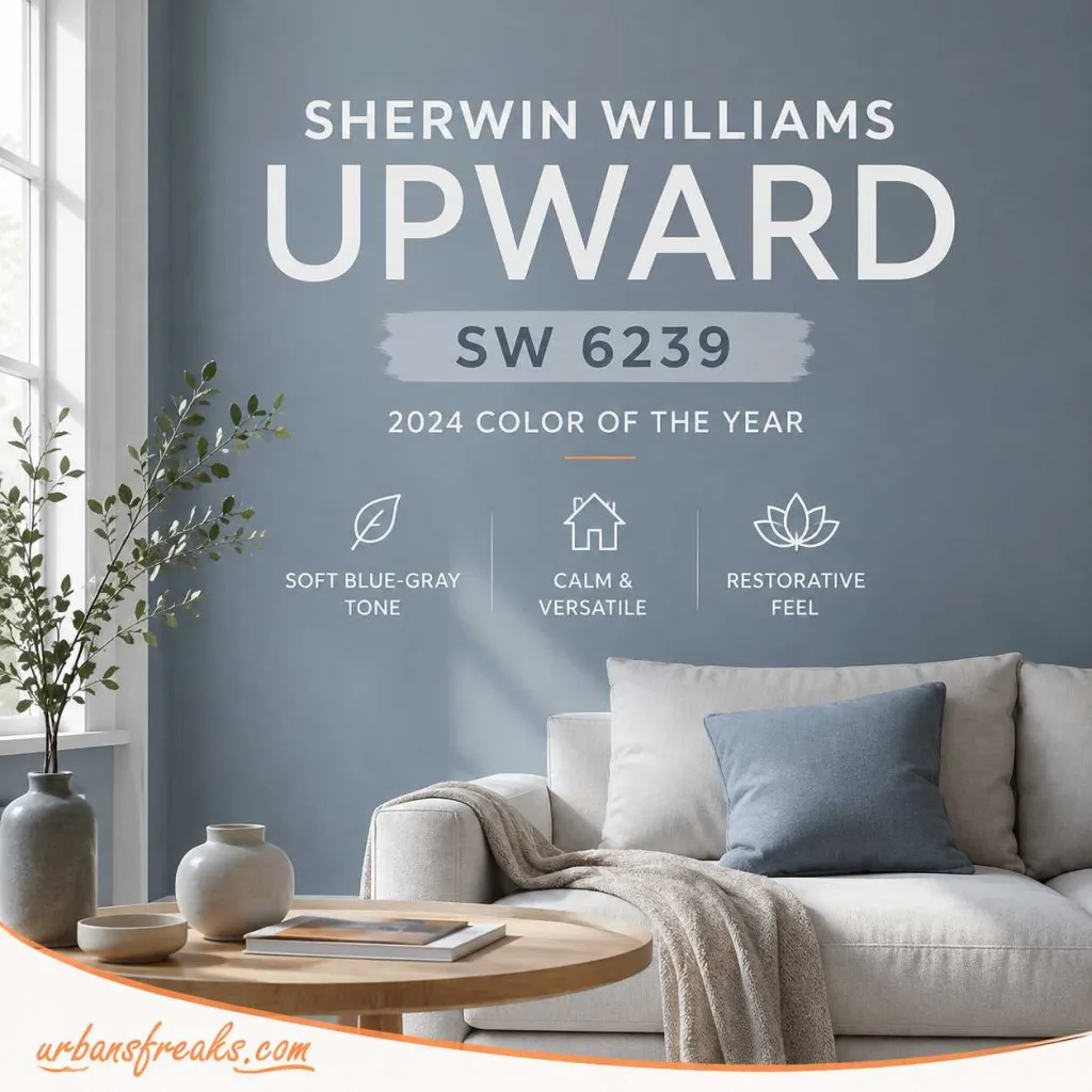
Quick facts about Sherwin Williams Upward SW 6239:
| Detail | Value |
|---|---|
| Color code | SW 6239 |
| Family | Blue-gray |
| LRV | 57 |
| Undertone | Cool, gray with a hint of violet |
| Best paired with | Pure White, Extra White, Naval, Peppercorn |
| 2024 status | Sherwin-Williams Color of the Year |
Sherwin Williams Upward SW 6239 Undertones
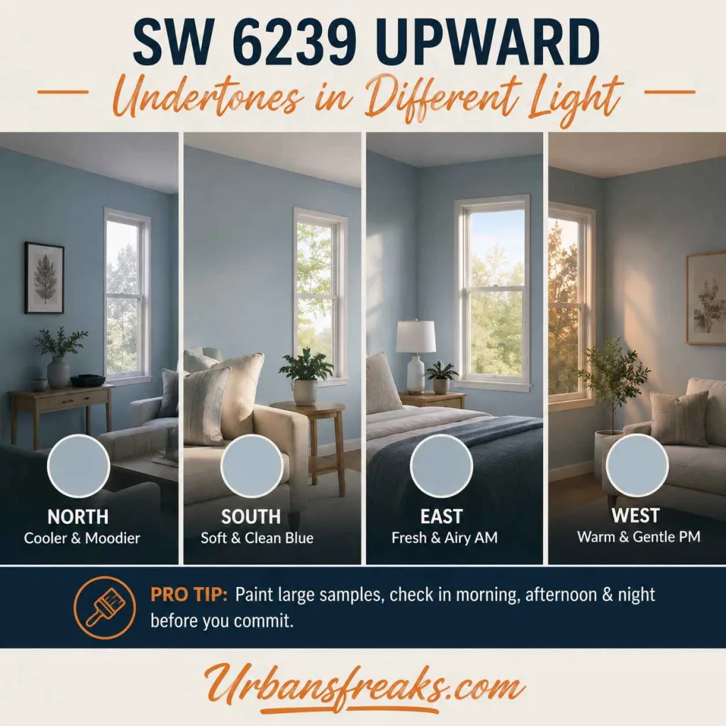
This is where most people get surprised. Sherwin Williams Upward SW 6239 looks different depending on the room’s light.
- North-facing rooms: the gray-violet undertone comes forward. It can look slightly cooler and moodier.
- South-facing rooms: sunlight warms it up. It reads more like a soft, clean blue.
- East-facing rooms: morning light brings out a fresh, airy blue that softens by afternoon.
- West-facing rooms: evening light adds warmth, making the gray base feel gentle rather than cold.
This is normal for any color with a mixed undertone, and it’s exactly why I never pick a wall color from a small chip. Paint a large sample — at least a two-foot square — on more than one wall, and look at it morning, afternoon, and night before you commit.
Sherwin Williams Upward SW 6239 LRV: Is It Light or Dark?
Upward has an LRV of 57. LRV stands for Light Reflectance Value, and it tells you how much light a color bounces back into a room, on a scale from 0 (black) to 100 (pure white).
At 57, Sherwin Williams Upward SW 6239 sits right in the middle. It’s light enough to keep a room feeling open and bright, but it still has enough depth to read as a real color, not a near-white. This is one reason it works in so many different rooms — it’s rarely too dark and rarely too washed out.

Best Paint Finish for Sherwin Williams Upward SW 6239
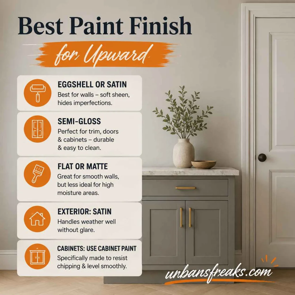
The finish you pick changes how Sherwin Williams Upward SW 6239 looks just as much as the light does.
- Eggshell or satin: the safest choice for walls. It gives a soft sheen without showing every bump or roller mark.
- Semi-gloss: best for trim, doors, and cabinets. It holds up to cleaning and adds a crisp edge next to the flatter wall color.
- Flat or matte: works if your walls are in great shape, but it can look chalky in bathrooms or kitchens where moisture and grease are a factor.
- Exterior use: stick with a satin exterior formula. It handles weather better than flat and won’t glare like gloss.
For cabinets specifically, ask for a paint made for cabinetry, not standard wall paint in a higher sheen. It levels out smoother and resists chipping around handles.
Best Rooms for This Color: Bedroom
This is probably the most popular use for this shade, and I understand why. A bedroom needs a color that calms the mind, and Upward does that job well.
- It works beautifully as a full four-wall color, especially with white or natural wood trim.
- Pair it with warm wood furniture to stop the room from feeling too cold.
- Add layered textiles — linen, wool, cotton — in warm neutrals to balance the cool undertone.
- Ceiling in a soft white keeps the room feeling tall and airy.
For a primary bedroom, I often recommend Upward on all four walls with Sherwin-Williams Pure White on trim. It’s a safe, sophisticated combination that doesn’t feel trendy or dated.

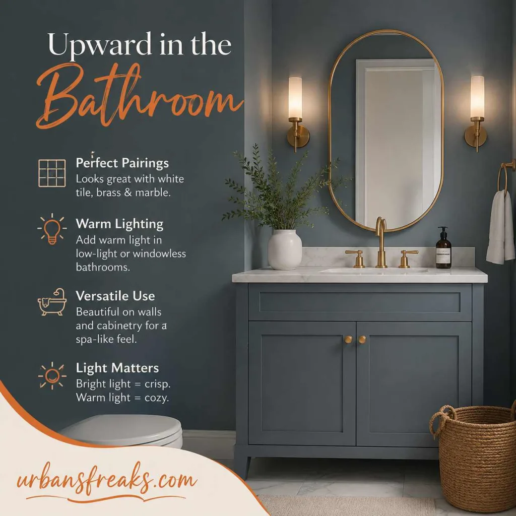
Bathroom Use
Bathrooms are usually smaller and lower in natural light, which is exactly the kind of space that benefits from a mid-range LRV color like this one.
- It pairs well with white tile, brass or matte black fixtures, and marble-look countertops.
- In a powder room with little natural light, add a warm light source to stop the color from leaning too cool.
- Works well on both walls and cabinetry for a cohesive, spa-like feel.
If your bathroom gets strong natural light, Sherwin Williams Upward SW 6239 will look crisp and fresh. If it’s a windowless bathroom, lean on warm-toned lighting to keep it from feeling flat.
Nursery Use
Sherwin Williams Upward SW 6239 is a common nursery pick because it’s calm without being overly “baby blue.” The gray undertone keeps it grounded, so it doesn’t feel childish, and it will still work as the room grows with your kid.
- Pair with warm wood furniture and soft cream textiles for balance.
- Add a few warm accent colors — like blush or ochre — so the room doesn’t feel too cool overall.
- It works for any gender, which is part of why designers reach for it so often.

Kitchen Cabinets
Cabinet color is a bigger commitment than wall color, so it’s worth knowing how Sherwin Williams Upward SW 6239 behaves here specifically.
- On kitchen cabinets, it reads as a fresh, airy blue in daylight and shifts toward a quieter gray-blue in the evening.
- Pair with brass or unlacquered brass hardware for warmth, or with matte black for more contrast.
- Works well against white countertops and light wood floors.
- On an island only, it adds a soft pop of color without overwhelming a mostly white kitchen.
- On full cabinetry, it gives the kitchen a coastal, uplifting feel without going full navy or teal.
I’d avoid pairing Upward cabinets with cool gray countertops — it can flatten the whole kitchen. Bring in a warm material somewhere, whether that’s the floor, the hardware, or the countertop veining.

Exterior Use
On an exterior, Upward behaves differently than it does indoors, mostly because there’s no artificial lighting to soften it and far more natural light hitting it throughout the day.
- It reads as a soft, muted blue-gray, close to a classic coastal or cottage exterior color.
- Works well on siding paired with white trim and a black or navy front door.
- Holds up nicely on brick-and-siding combination homes, especially where the brick has cool gray tones.
- In very sunny climates, it can look lighter and slightly washed out — a slightly deeper blue-gray might read truer from the street.
If you’re deciding between an interior and exterior use, always test the exterior sample outside, not through a window. Glass changes how a color reads more than most people expect.

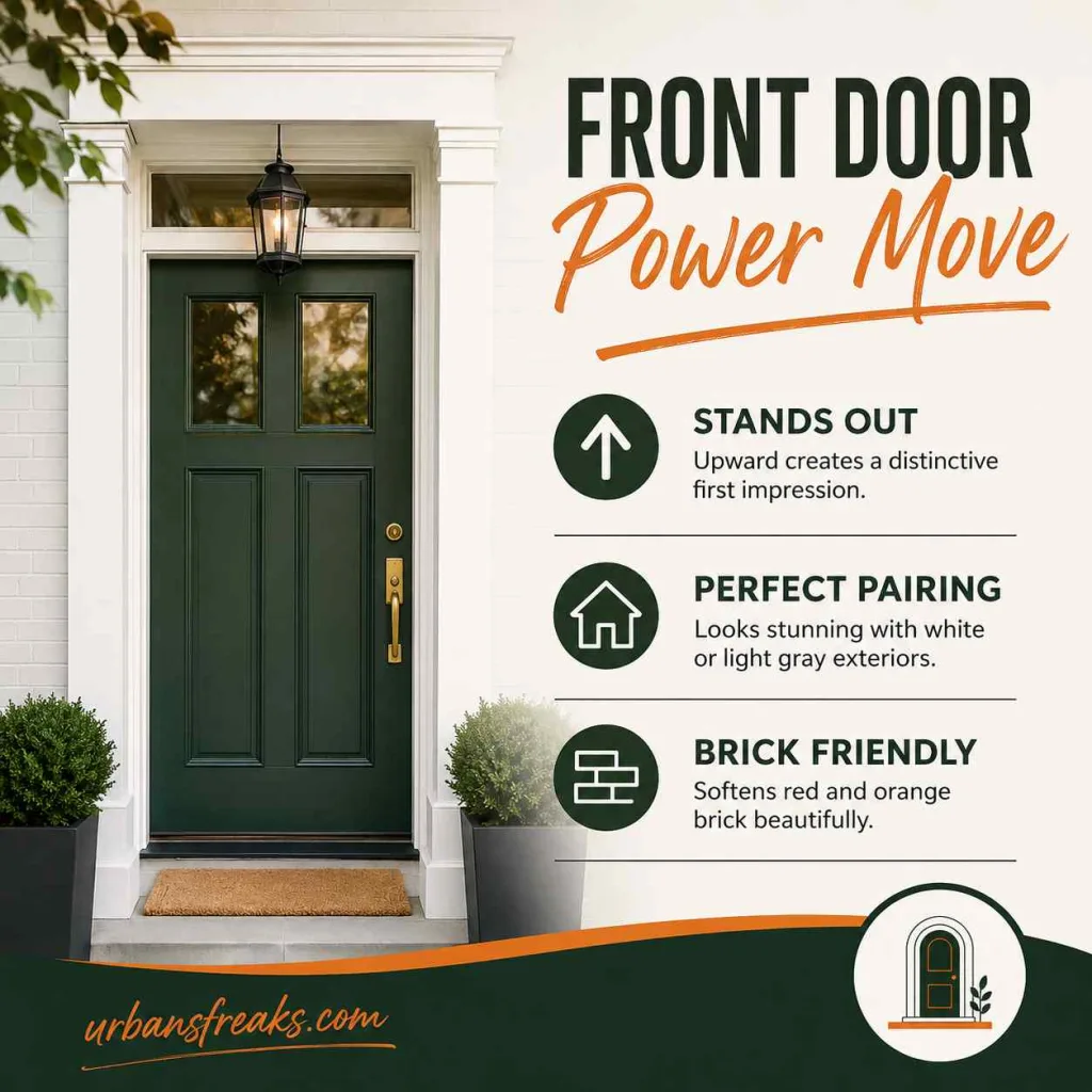
Front Door Use
A front door is a small surface, so it can handle a bit more punch than a full wall. Upward works especially well here because it’s distinctive without being loud.
- Pairs well with a white or light gray house color for a clean, classic contrast.
- Works nicely with black hardware and a natural wood or fiber doormat for warmth.
- On a brick home, it softens red or orange-toned brick nicely.
Lighting Tips for Best Results
Lighting changes this color more than most people expect, so a few small adjustments go a long way at Sherwin Williams Upward SW 6239.
- Use warm bulbs (around 2700K–3000K) if the room leans too cool or gray. This softens the blue and adds warmth back in.
- Avoid pure daylight bulbs (5000K+) in rooms without much natural light — they can push Upward toward a flat, cold gray.
- In rooms with big windows, natural daylight will do most of the work, so keep artificial light neutral rather than warm or cool.
- Dimmable fixtures give you more control over how the color shifts from day to evening.

How Upward Compares to Similar Colors
People often confuse Sherwin Williams Upward SW 6239 with a few other Sherwin-Williams shades, so here’s a quick breakdown:
| Color | How it differs from Upward |
|---|---|
| Sea Salt (SW 6204) | Greener, softer, less blue overall |
| Rainwashed (SW 6211) | Lighter, more green-gray, less punch |
| Naval (SW 6244) | Deep navy — a strong contrast partner for Upward |
| Smoky Blue (SW 7604) | Darker and moodier, less airy |
If you love Sherwin Williams Upward SW 6239 but want something a shade lighter, Rainwashed is worth a look. If you want more depth in the same family, Naval makes a strong accent wall paired with Upward on the rest of the room.
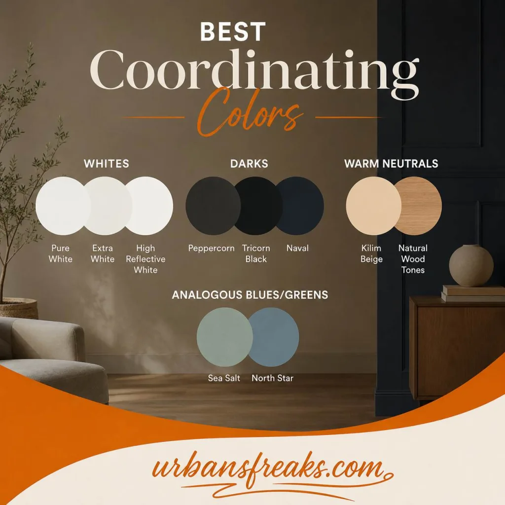
Best Coordinating Colors
- Whites: Pure White, Extra White, High Reflective White
- Darks: Peppercorn, Tricorn Black, Naval
- Warm neutrals: Kilim Beige, natural wood tones
- Analogous blues/greens: Sea Salt, North Star
Common Mistakes to Avoid
Most complaints about this color come down to a few avoidable errors while Sherwin Williams Upward SW 6239.
- Judging it from a tiny chip. A 2×3 inch swatch never shows the true undertone. Always test a large sample.
- Ignoring the room’s light direction. A north-facing room will look different from a south-facing one, even with the same paint.
- Pairing it with cool-toned everything. Too many cool grays and whites around it can make a room feel flat and sterile.
- Skipping the trim color test. Trim color changes how the wall color reads. Test them together, not separately.
- Using the wrong sheen for the room. A flat finish in a bathroom, or a glossy finish on a large wall, rarely looks right.

Sherwin Williams Upward SW 6239 Pros
- Works in almost every room type — bedroom, bathroom, nursery, kitchen, exterior
- Mid-range LRV keeps rooms bright without feeling stark
- Ages well; not a passing trend color
- Flexible with both warm and cool metals and wood tones

Sherwin Williams Upward SW 6239 Cons:
- Undertones shift noticeably with light direction, so testing matters
- Can feel cold in rooms with little natural light unless balanced with warm materials
- Not the right pick if you want a true, saturated blue

Frequently Asked Questions Sherwin Williams Upward SW 6239
Is Upward more blue or more gray?
It’s a balanced mix, but most people see it as a soft blue-gray. In warm light it leans blue; in cool light it leans gray.
Does Upward work in a small room?
Yes. Its mid-range LRV keeps small rooms from feeling boxed in, especially when paired with white trim.
Is Upward a good choice for resale?
Yes. It’s neutral enough to appeal to most buyers and hasn’t been tied to a passing trend, which helps it age well.
What’s the closest white to pair with Upward?
Sherwin-Williams Pure White or Extra White are the most common pairings, both giving a clean, crisp contrast.
My Final Take
I keep coming back to this color because it does something a lot of trend colors don’t — it works with the room instead of fighting it. Whether it’s a bedroom, a bathroom, kitchen cabinets, or a front door, Sherwin Williams Upward SW 6239 gives you a calm, adaptable backdrop that won’t feel dated in five years.
If you’re building a full room palette, browse more color and material guides in our Home Decor section — I add new comparisons and real project breakdowns regularly.